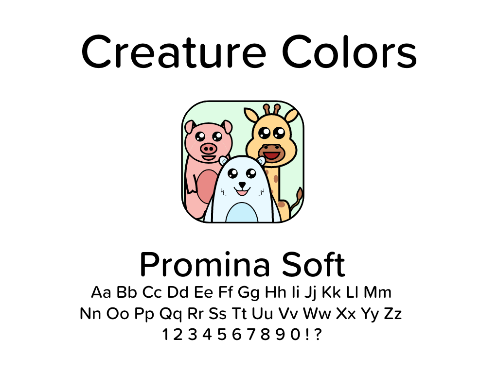
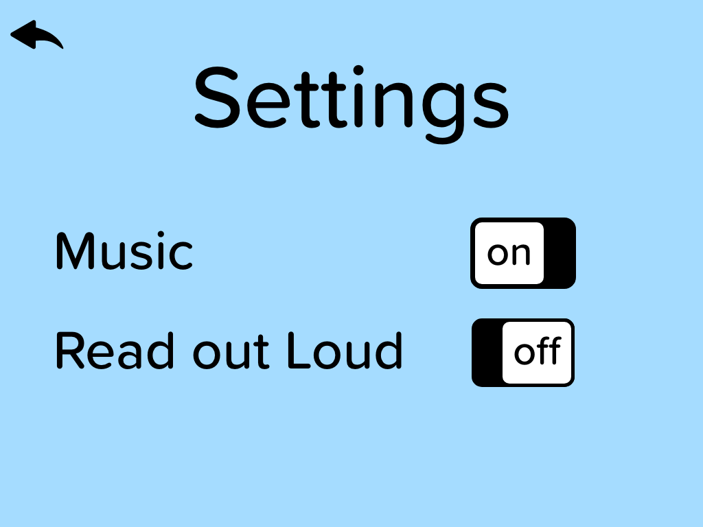
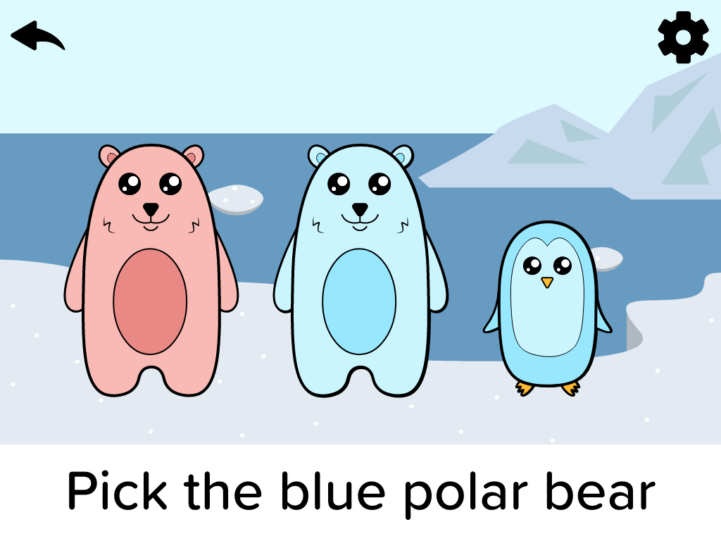
Creature Colors
Creature Colors is a mock childrens application designed to help young children identify animals and colors. The project started with branding, followed by wireframes, then comps.


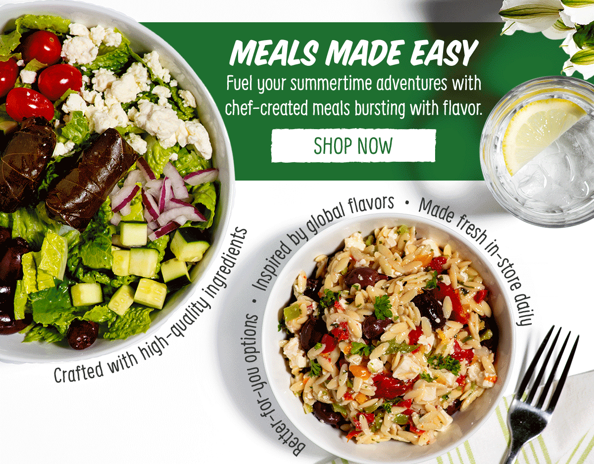
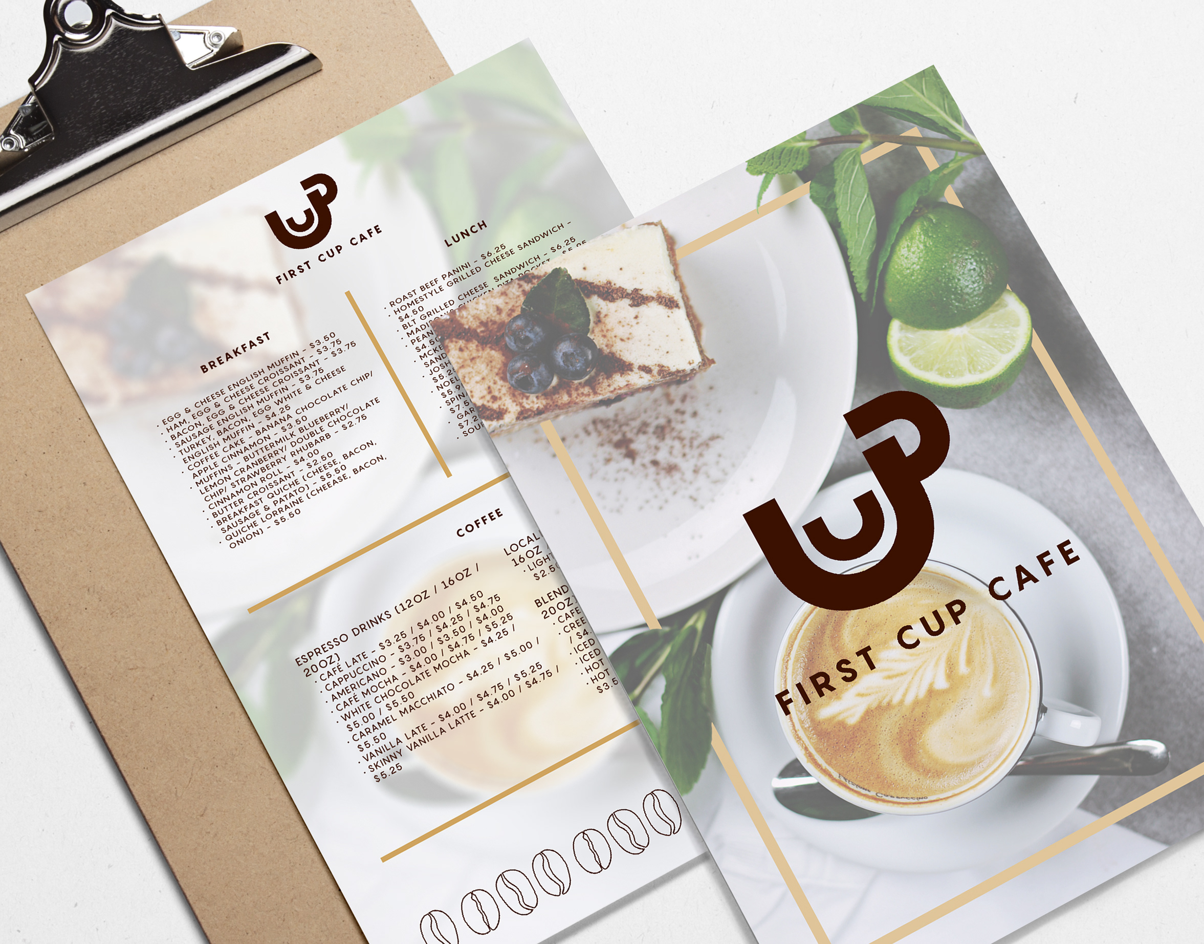
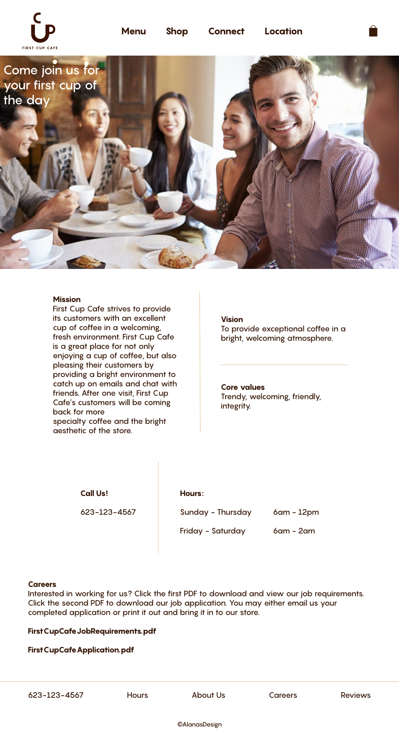
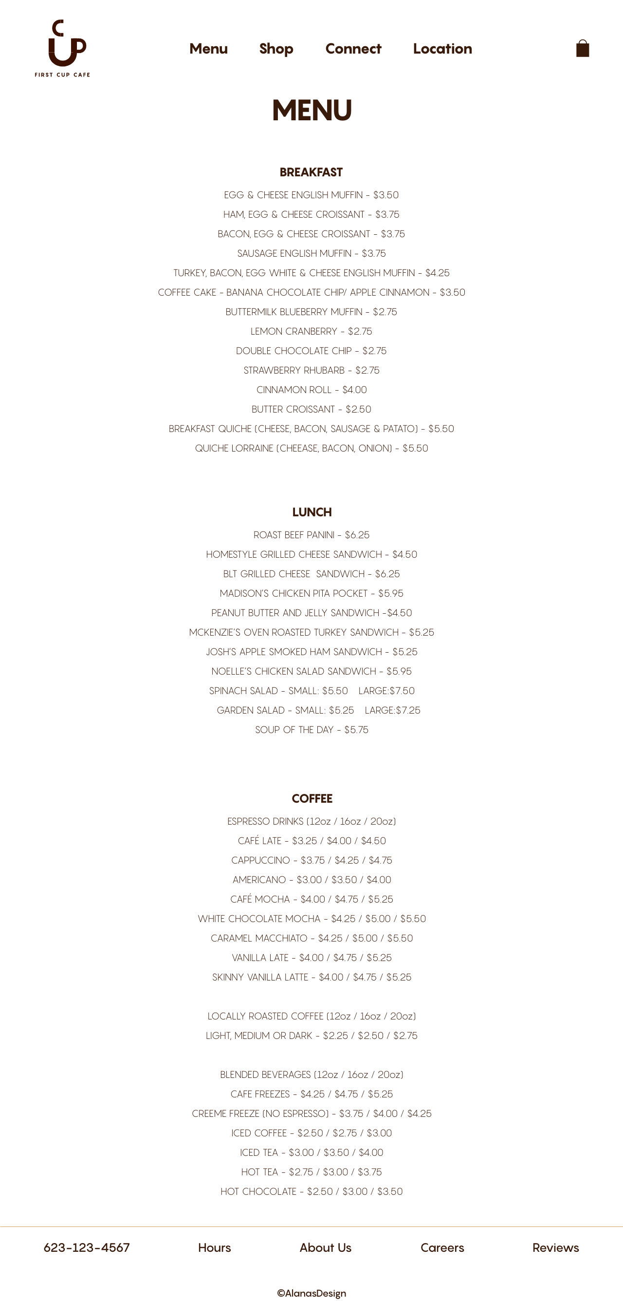
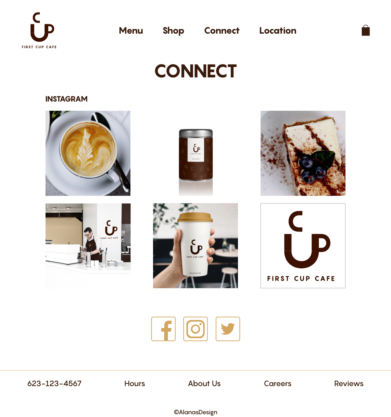
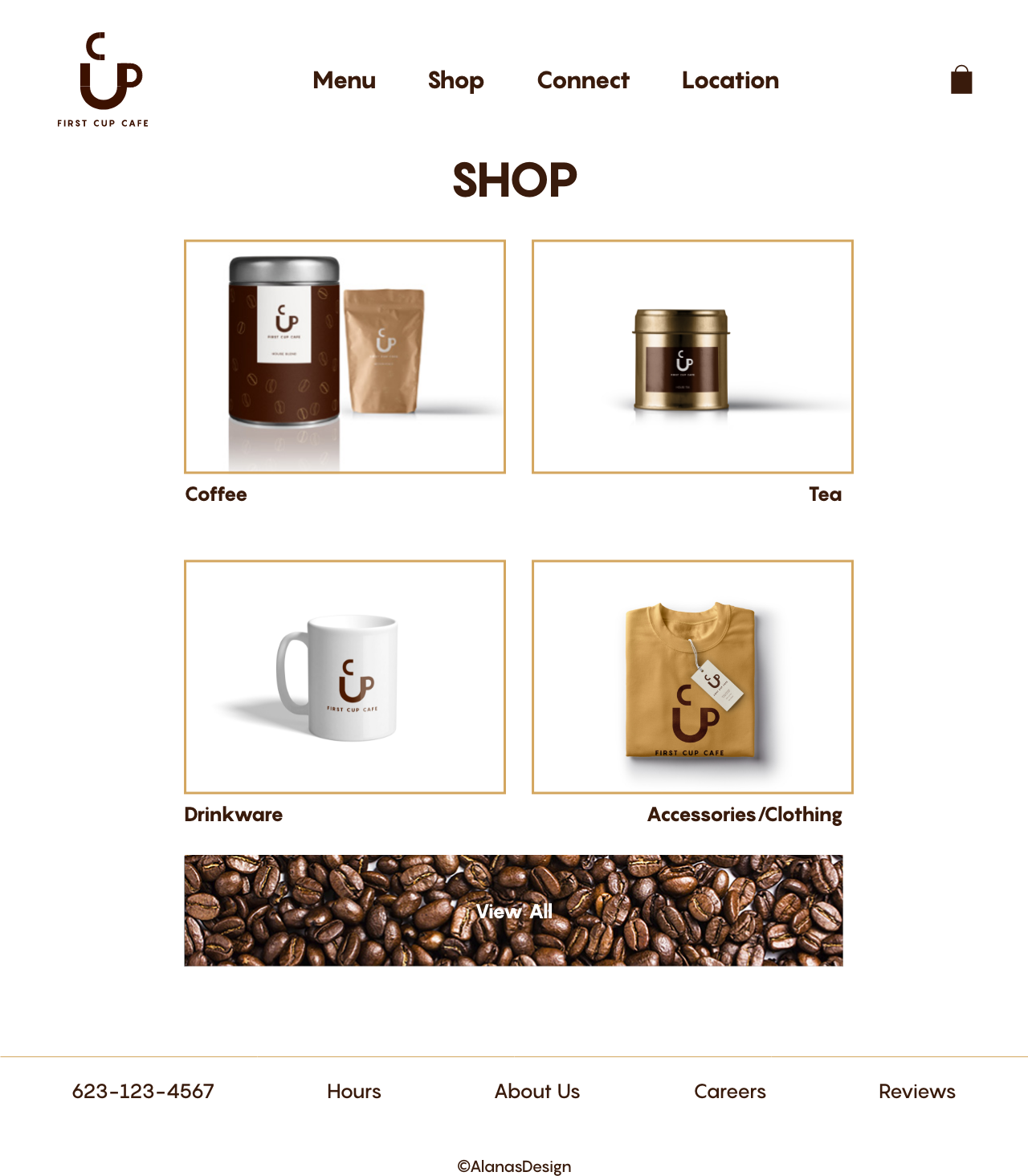
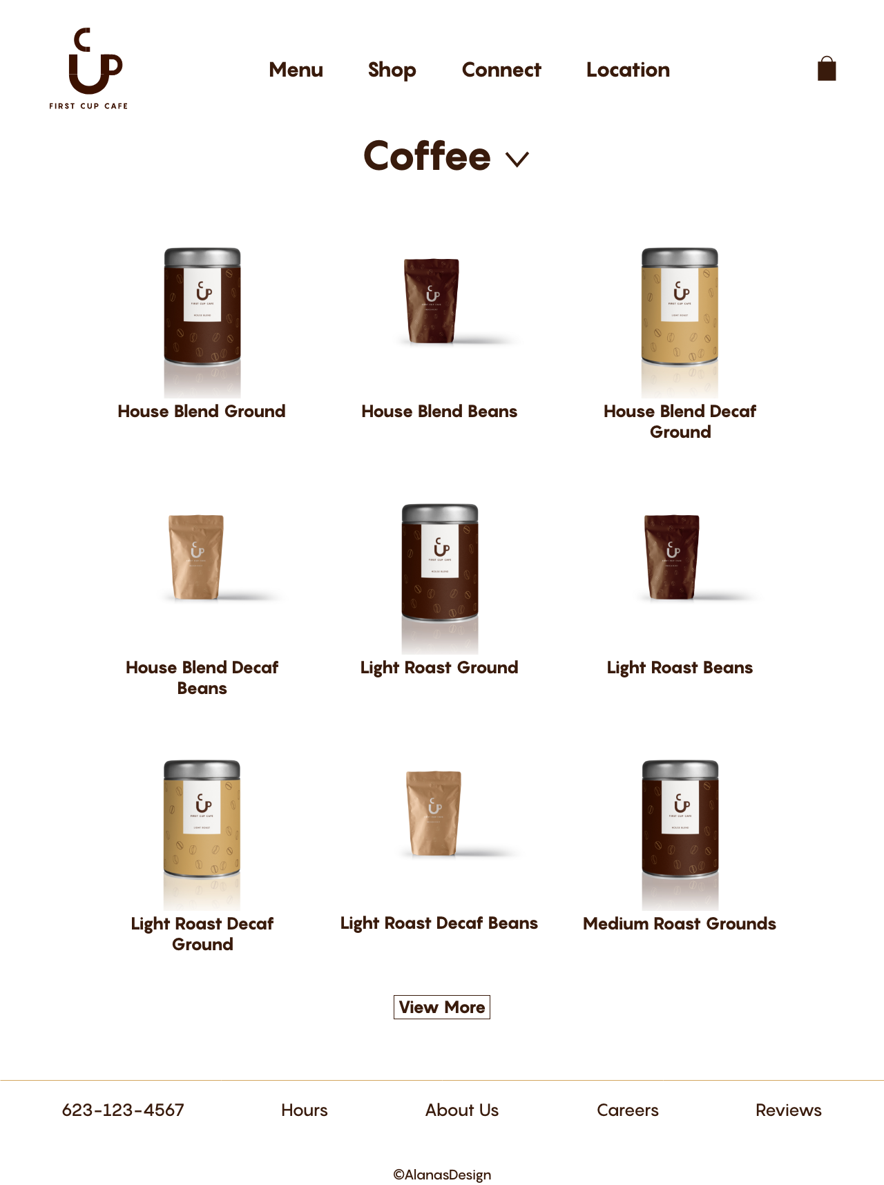
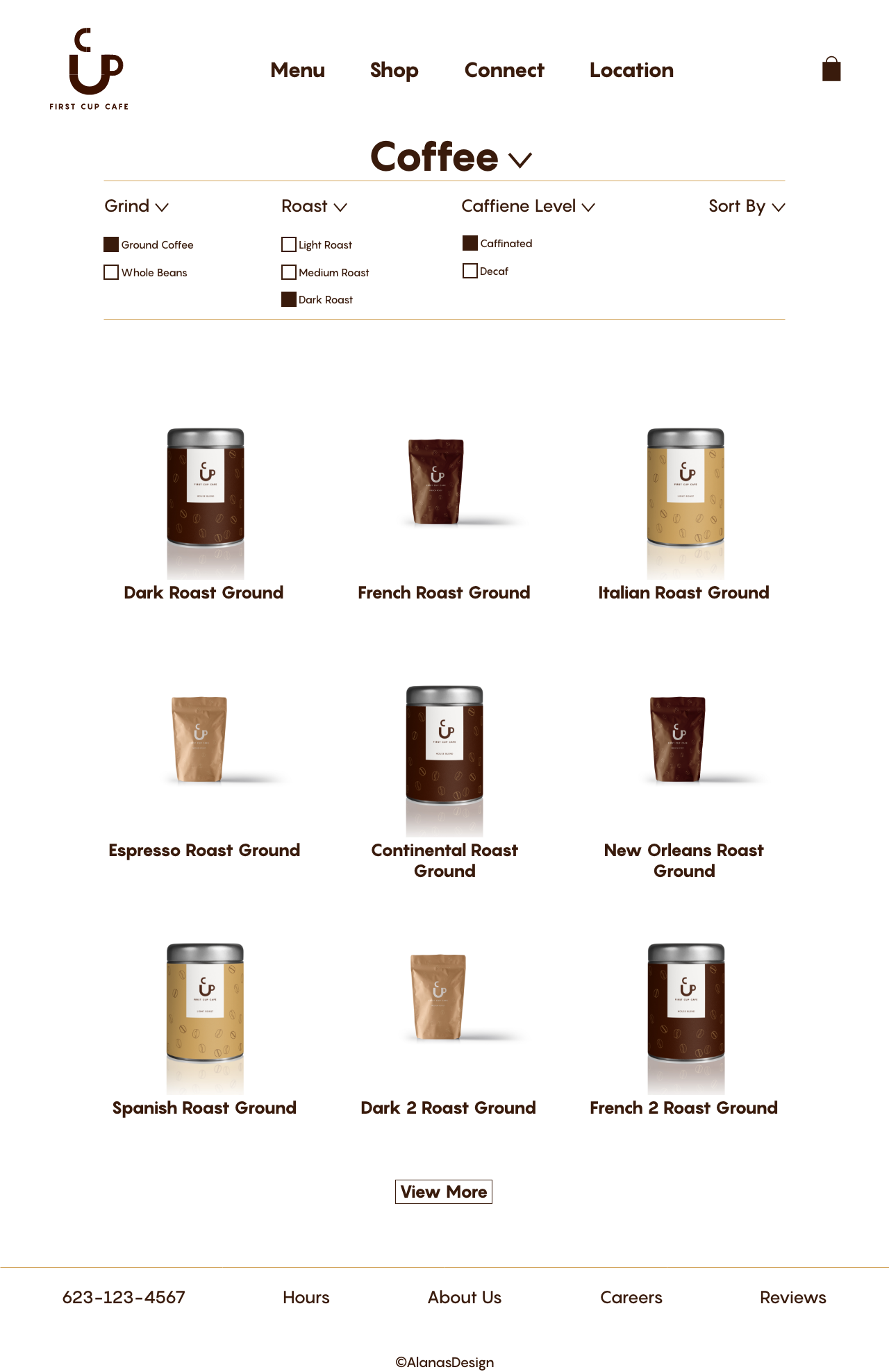
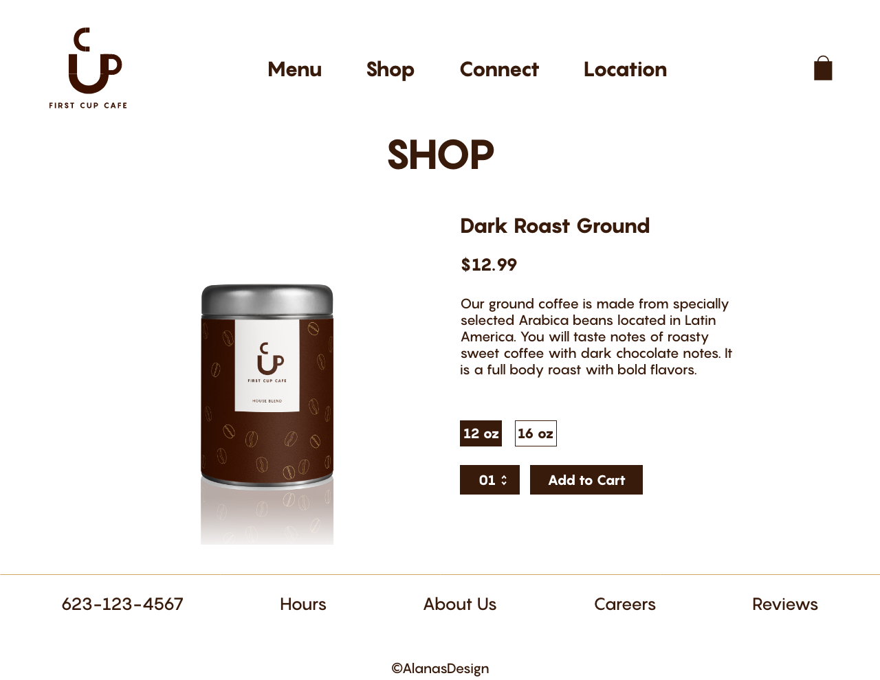
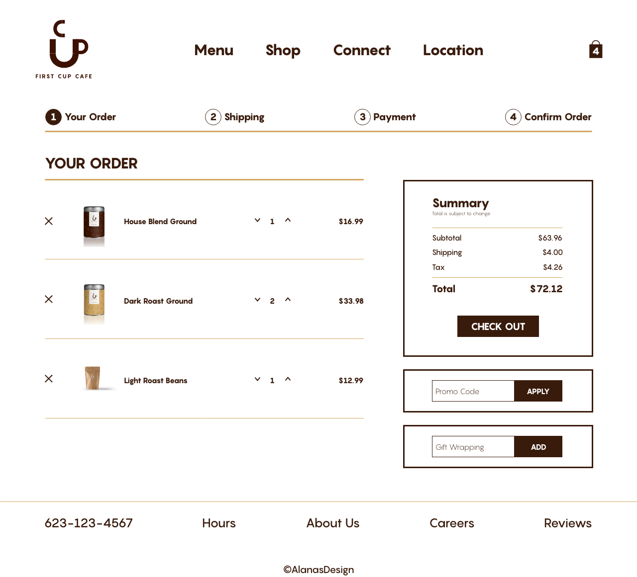
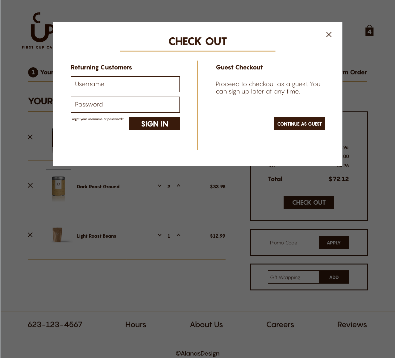
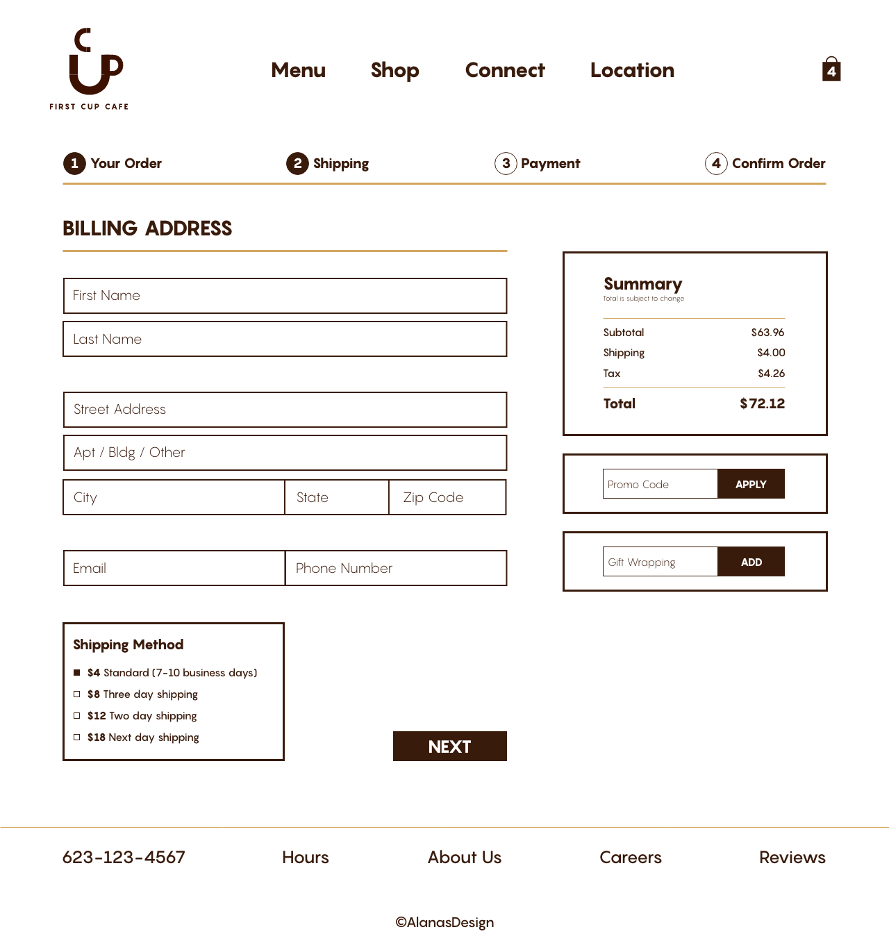
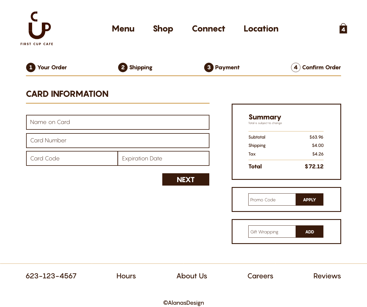
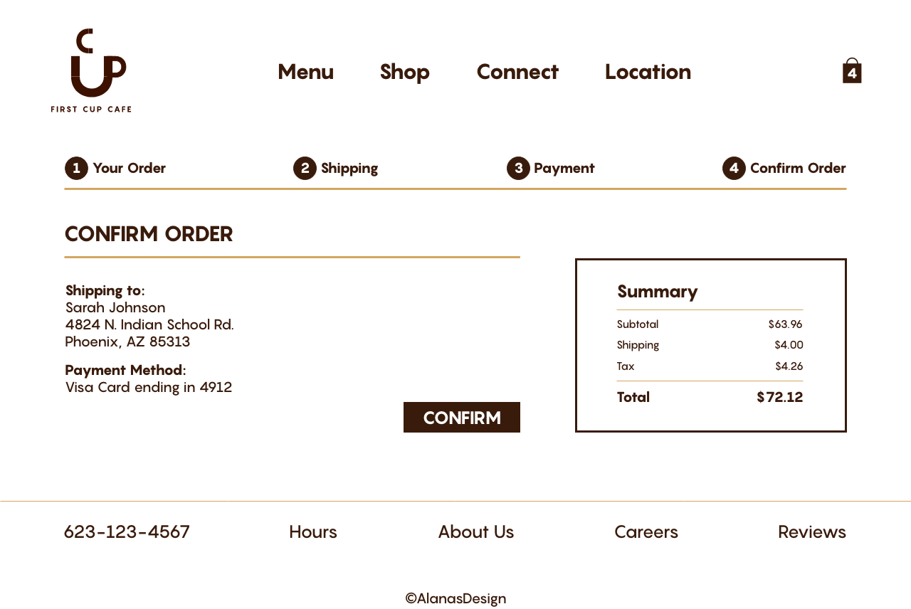
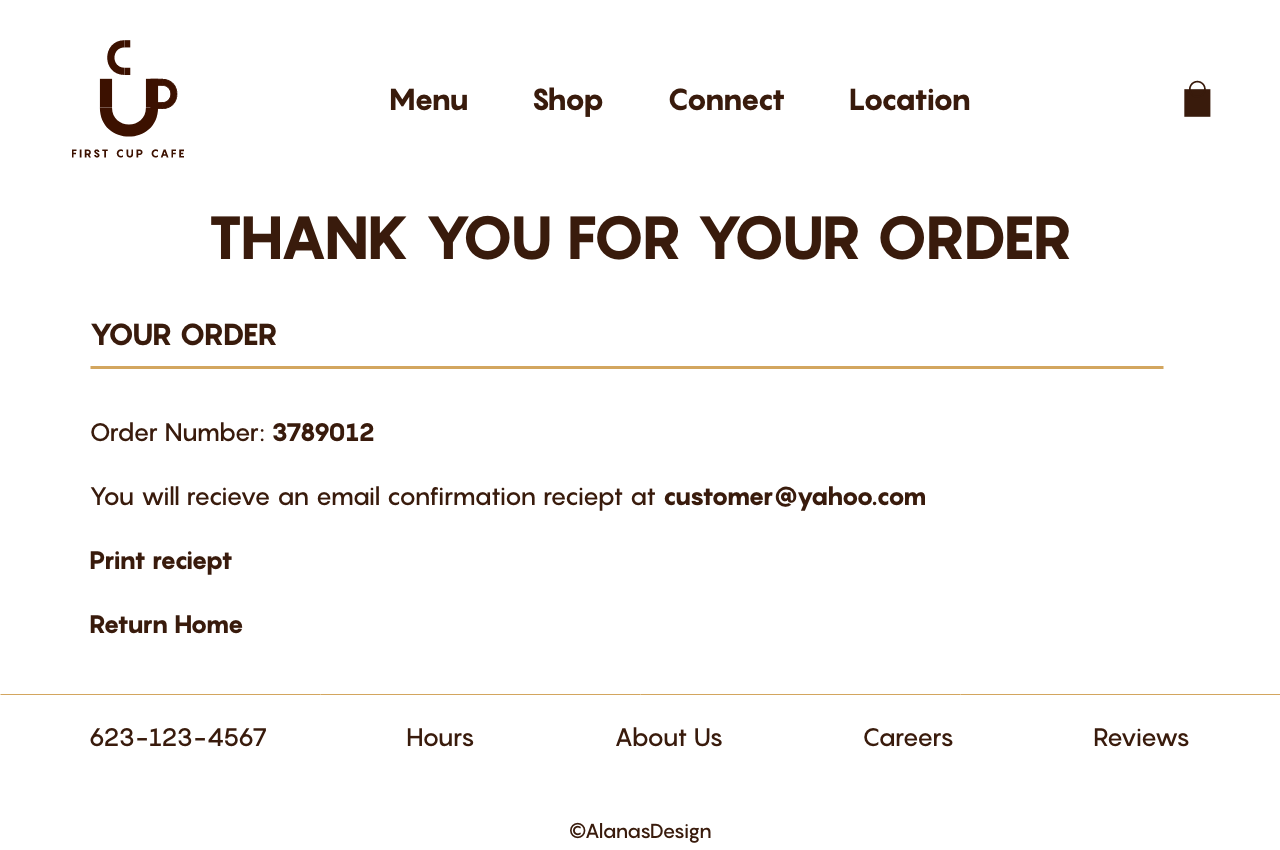
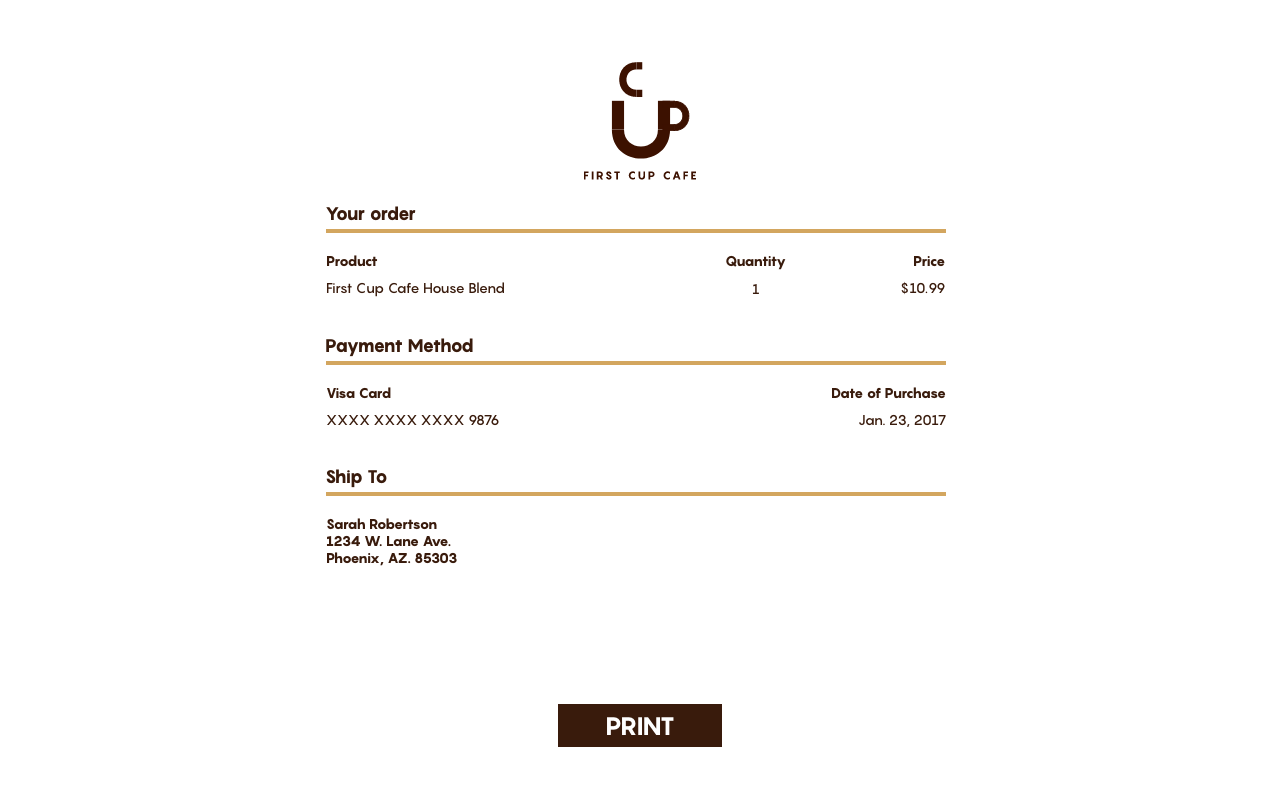
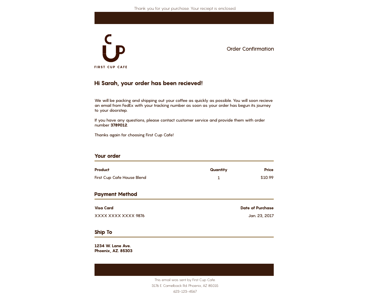
First Cup Cafe
First Cup Cafe is a mock coffee shop. The updated branding for this project can be found on my "Branding" tab. Shown below is a part of the ecommerce part of this project. Looking back on this project, I would fix some of the imagery (and of course switch the logo to the new one I later made), but I'm overall happy with how it turned out.


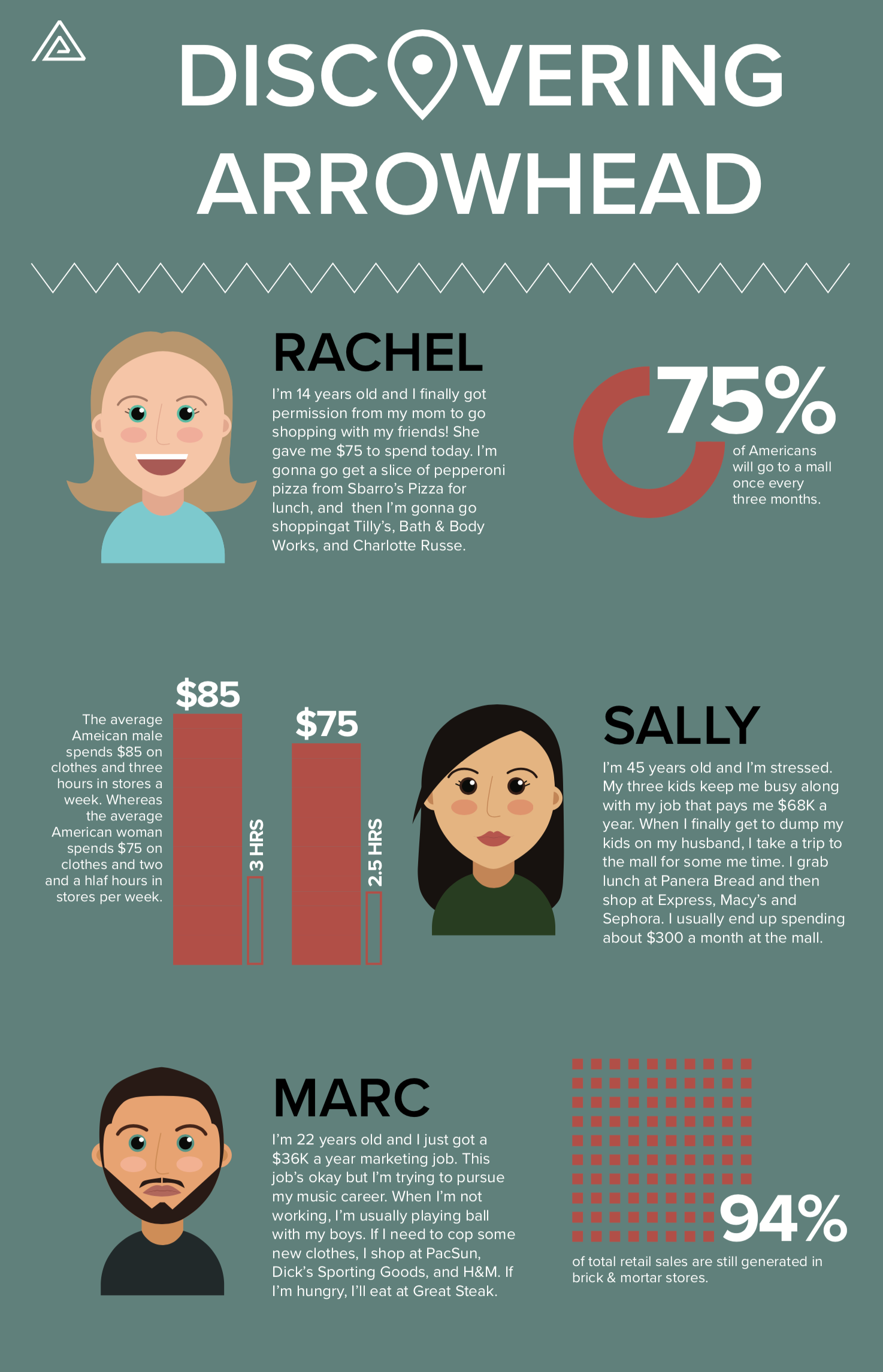
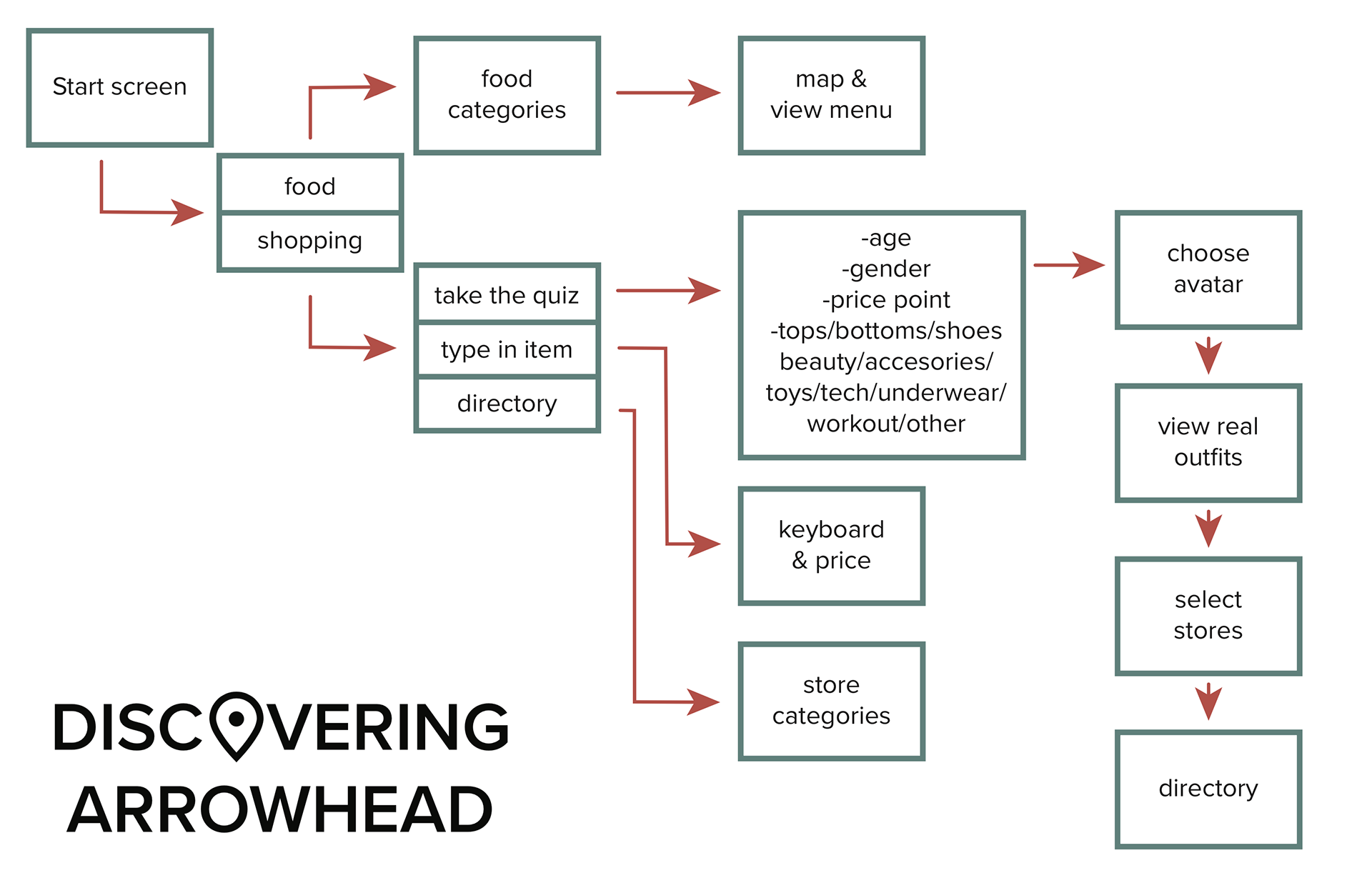
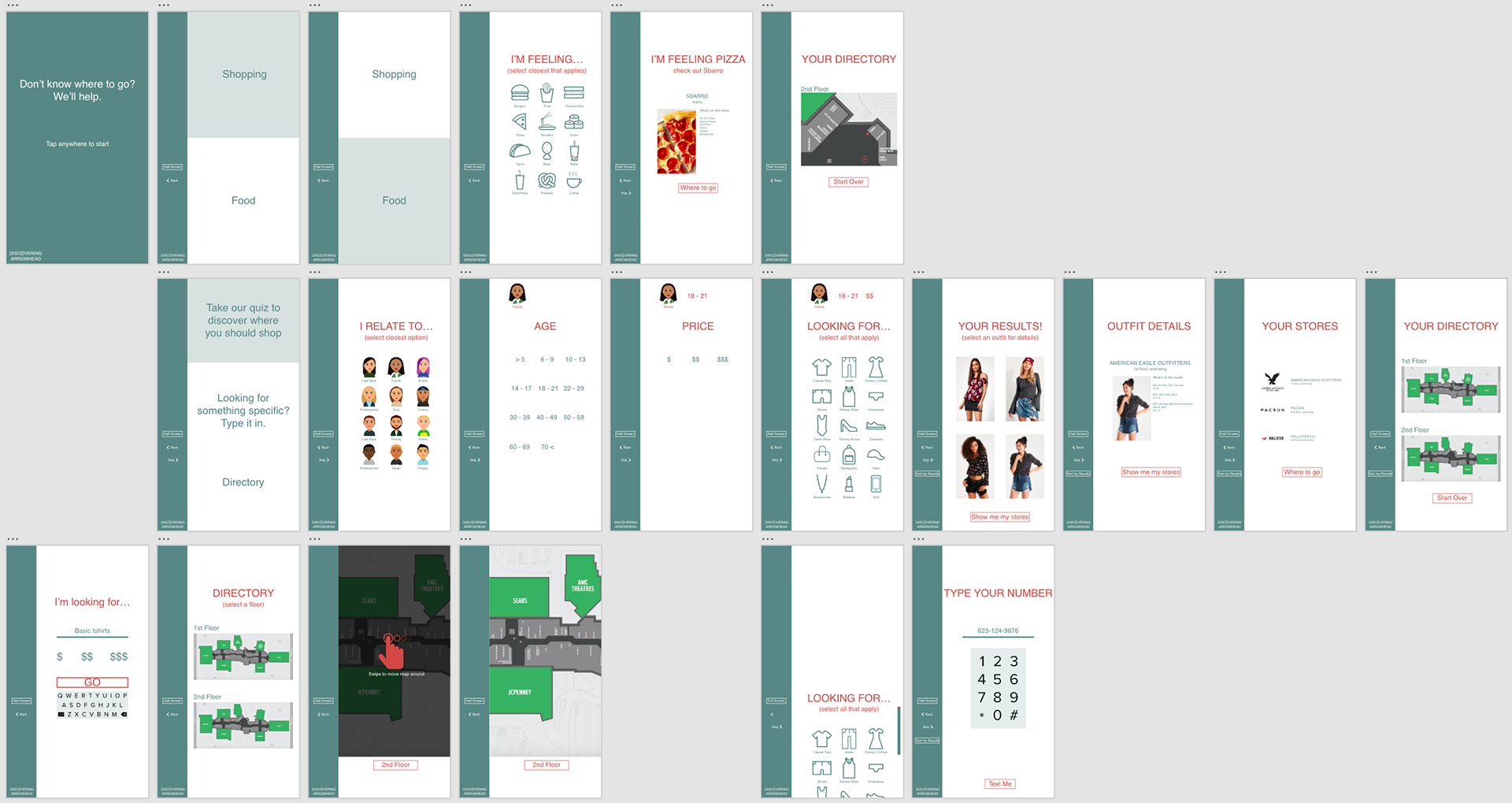
Discovering Arrowhead
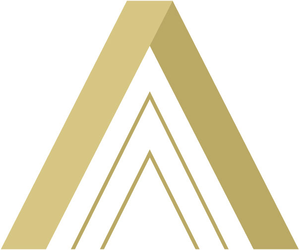
Discovering Arrowhead is a mock shopping mall kiosk. The direction for this project was to create a wayfinding kiosk for an existing location, so I chose Arrowhead Mall. I used Arrowhead's existing brand colors and used their triangular logo for this project. My goal for this project was to help customers identify where to spend their money. If they were hungry, it would direct them to a place to eat at depending on what they were craving. If the customer was looking to shop, they would create a simple profile based on what they most closely identified to. Looking back on this project, I would fix some of the spacing and change the color scheme.
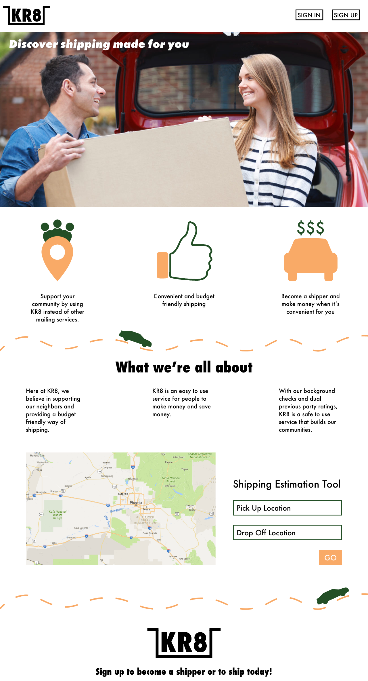
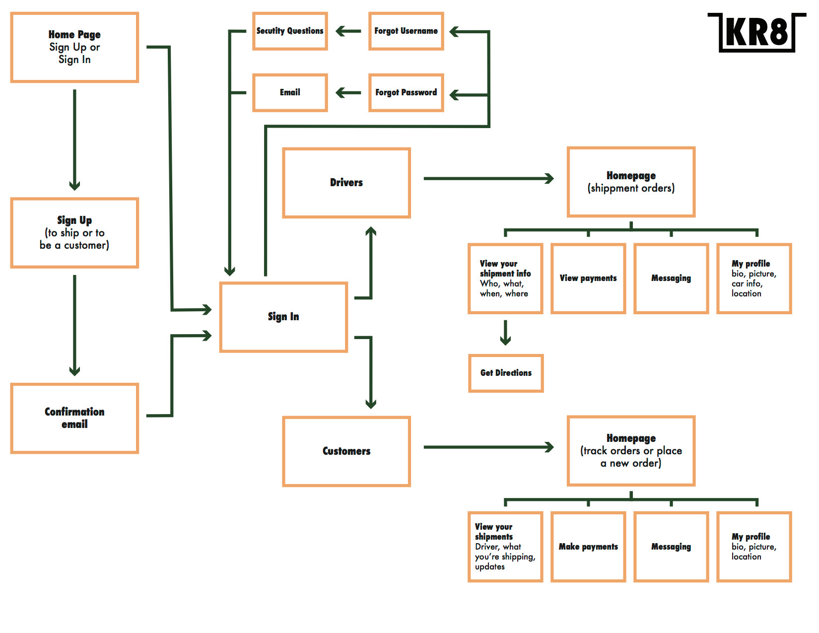
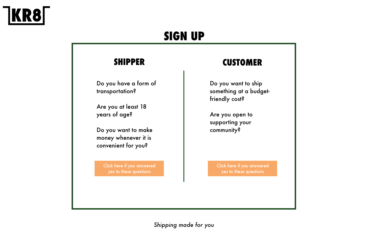
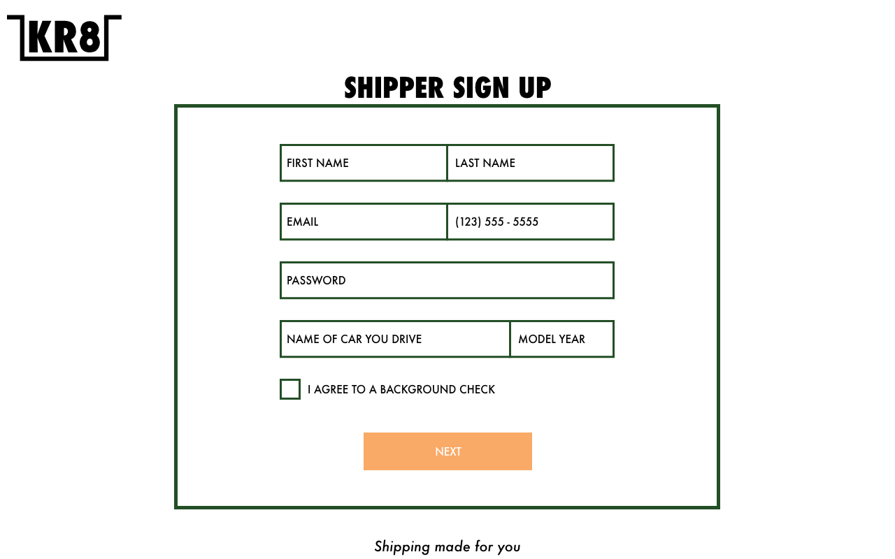
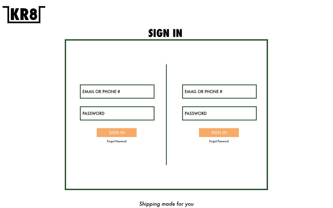
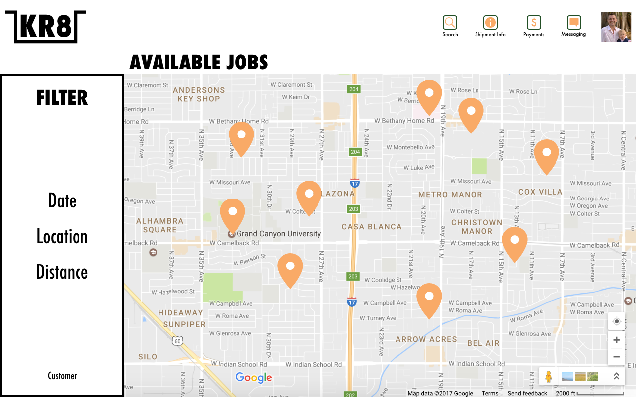
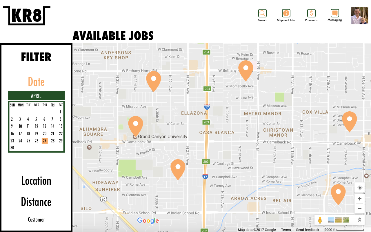
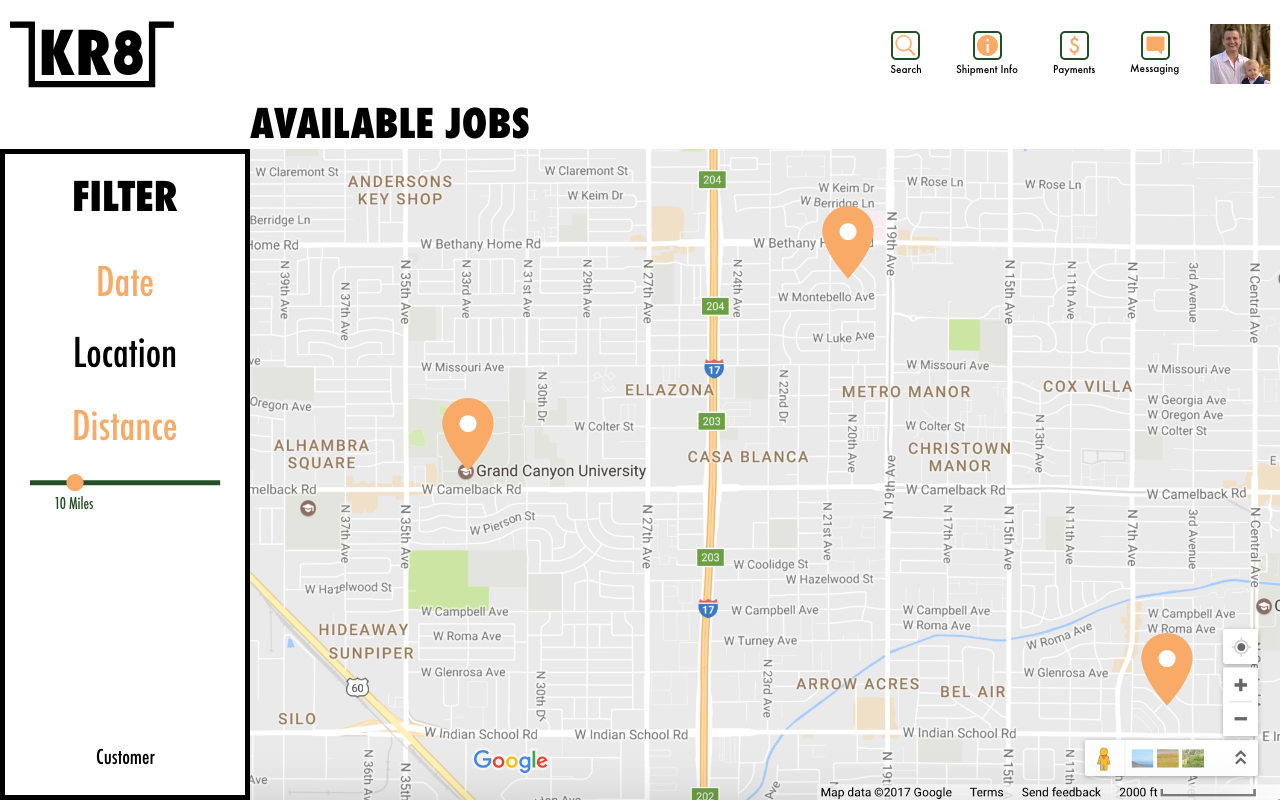
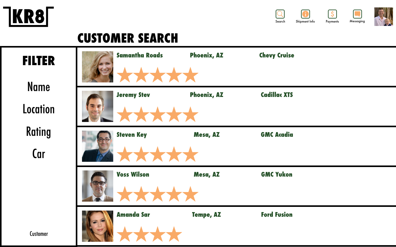
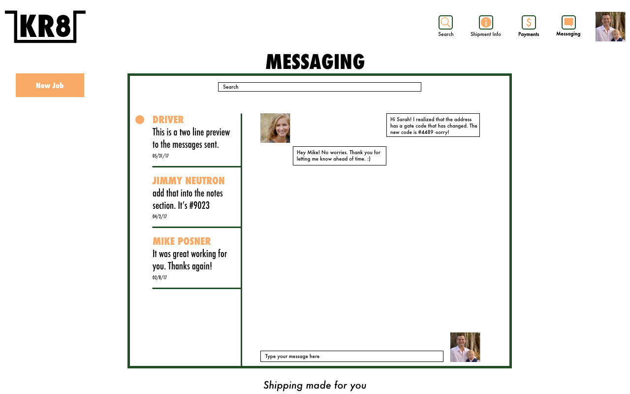
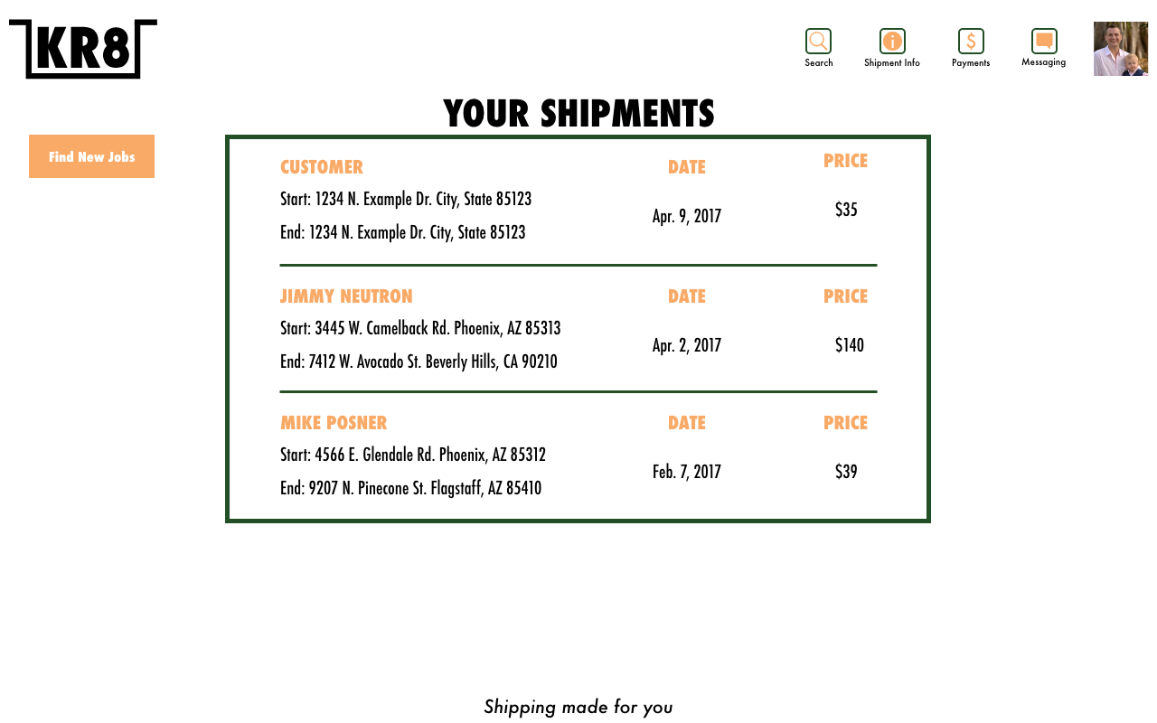
KR8
KR8 is a mock shipping service (similar idea to Uber). This assignment included branding, user flow, and web application design. Looking back on this project, I would tweak the design and change the color pallete. Below is a landing page, site map, and app screens.

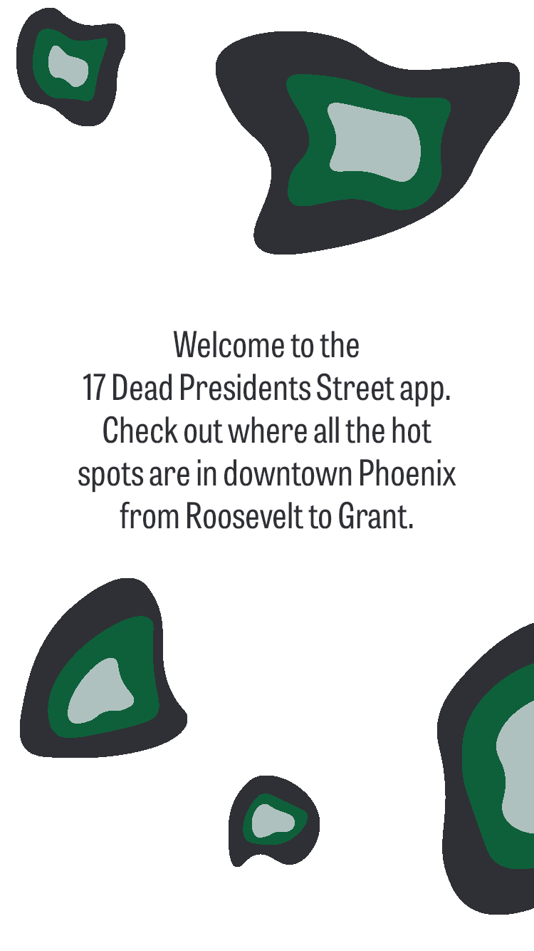
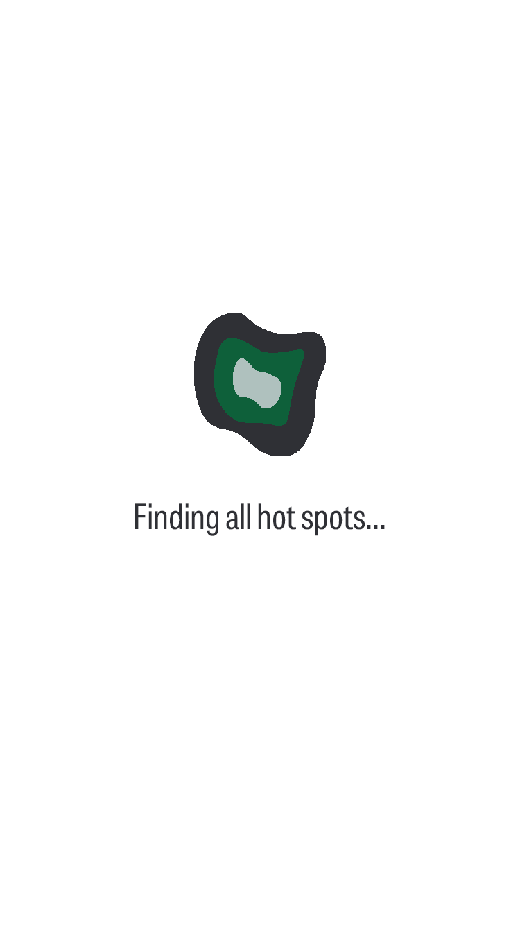
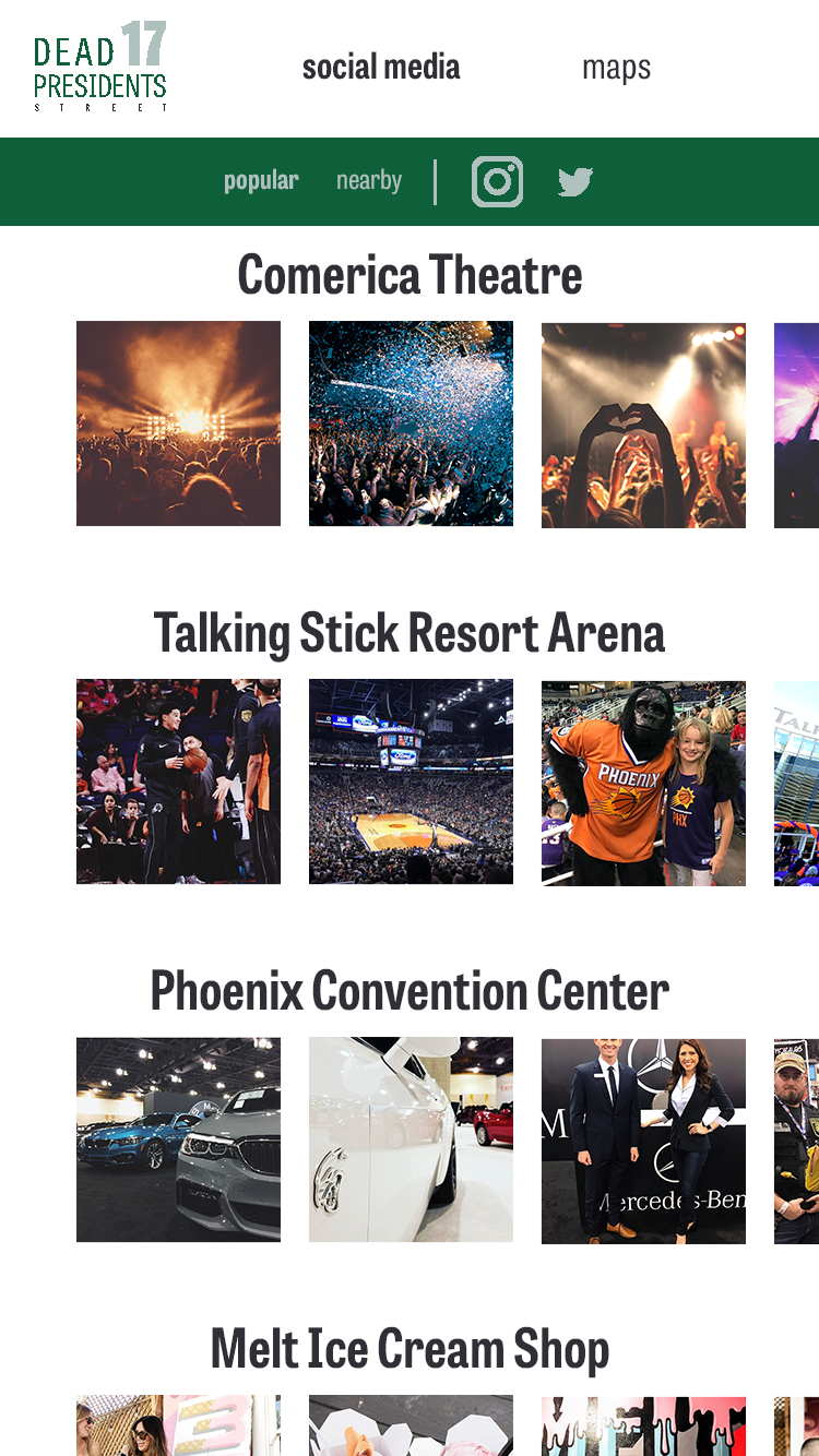
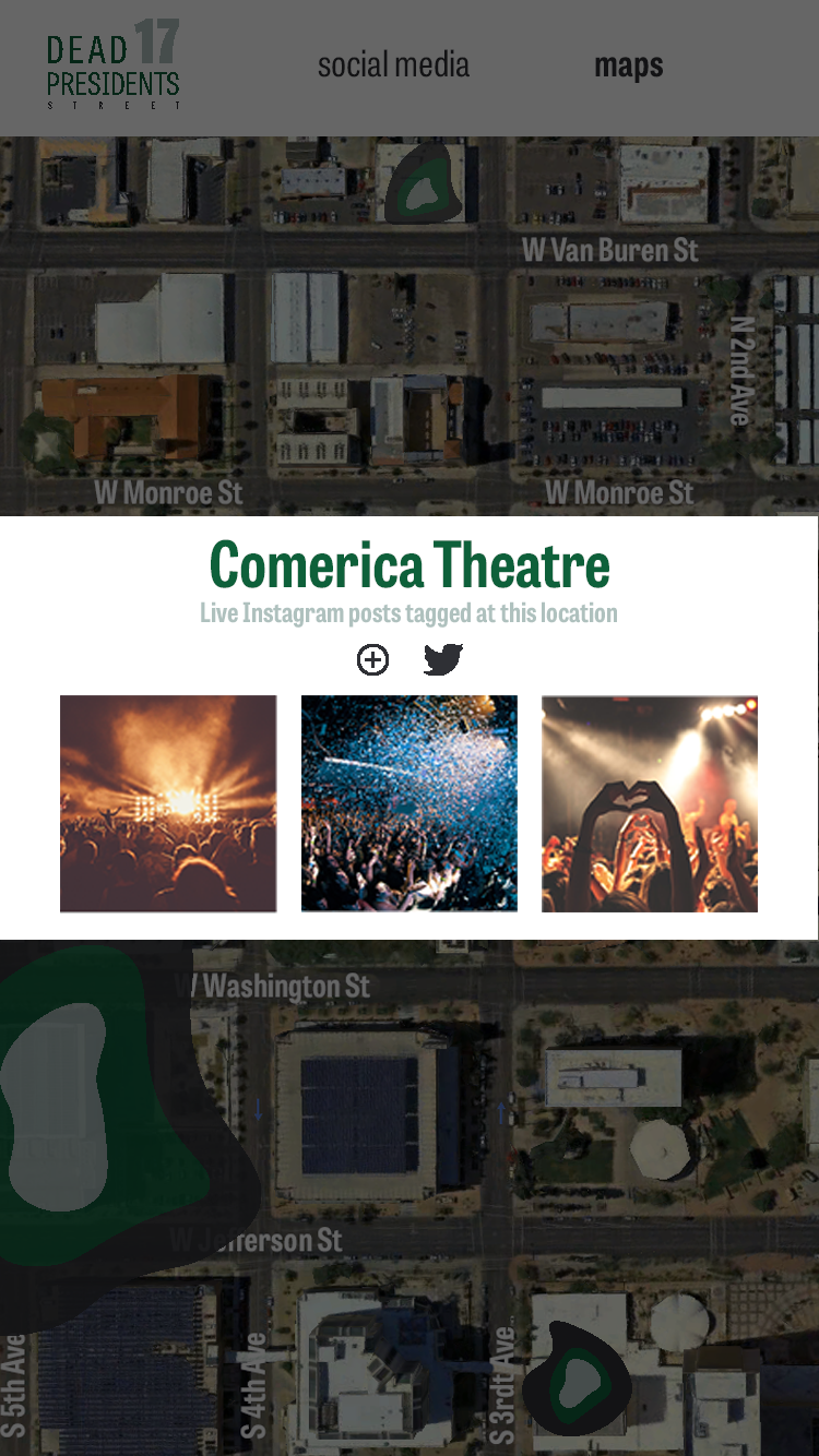
17 Dead Presidents
17 Dead Presidents is a mock geolocation app. In Downtown Phoenix, there are 17 streets, all of which are named after presidents that have passed away. From there, I connected that fact about downtown with money. (Dead Presidents is a slang term for bills.) This is how I came up with the naming/branding. The goal of this app is to check out the hotspots in Downtown Phoenix as people are posting about it. This concept is similar to Snapchat's map feature which debuted about five months before I designed this. ...Which I honestly didn't see until after this project- or else I would've done a few things differently TBH.
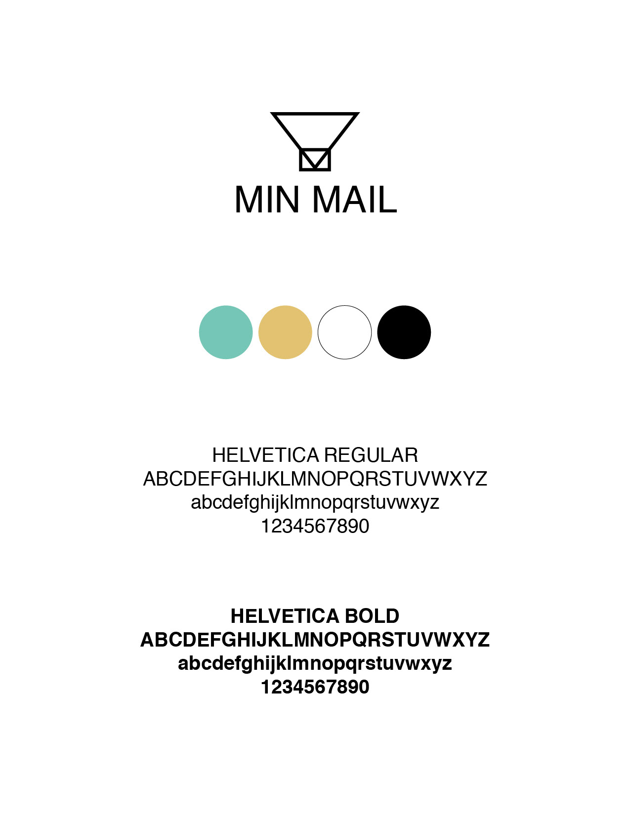
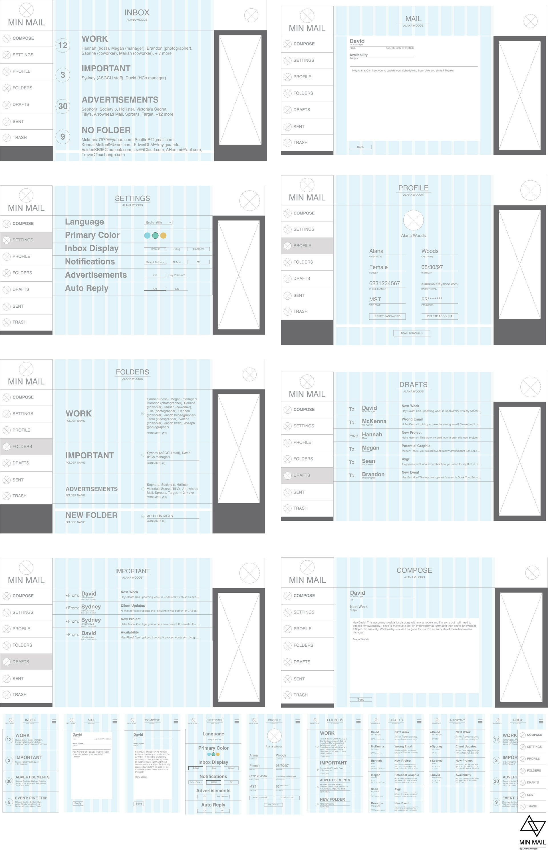
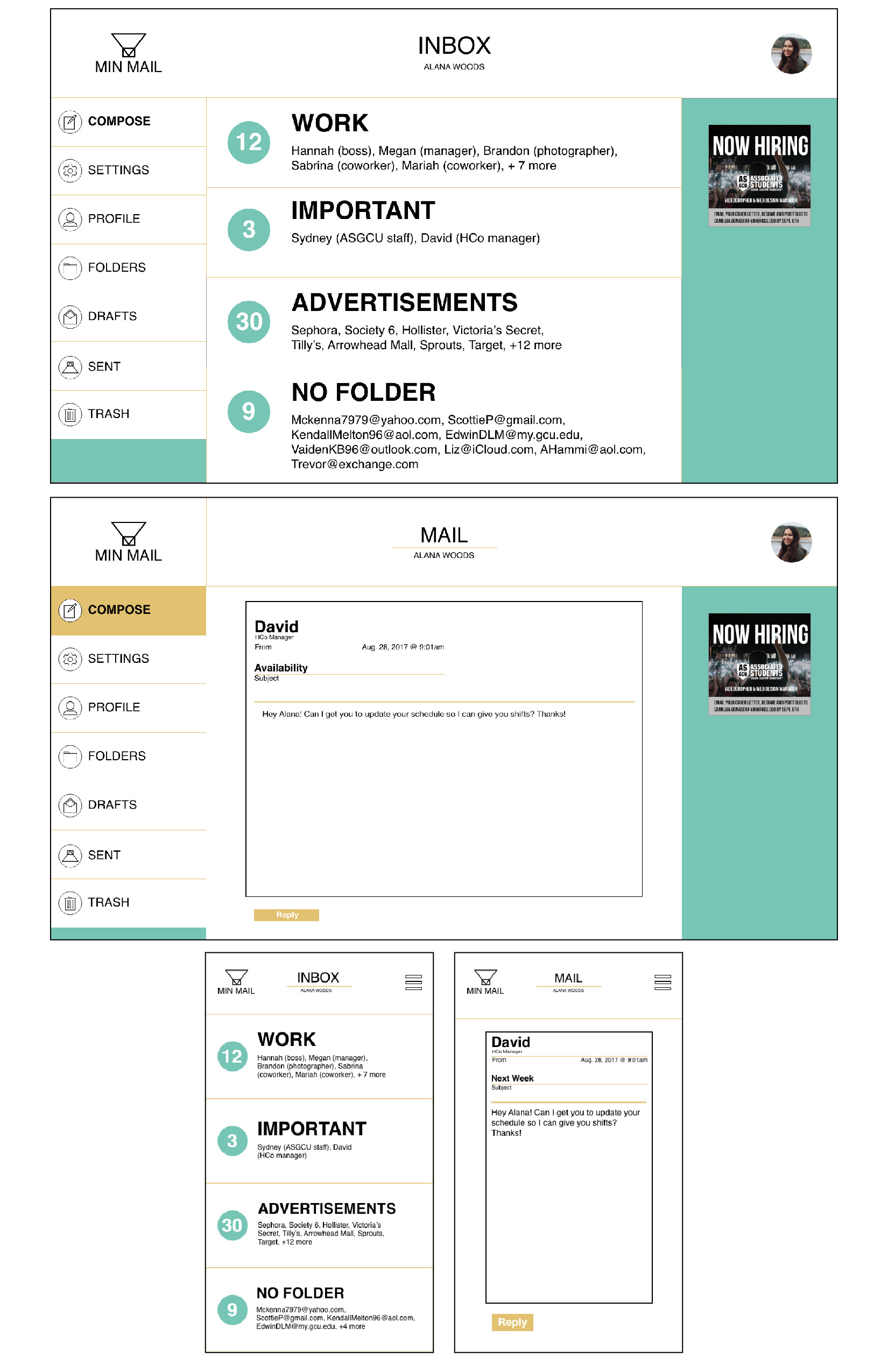
MIN MAIL
MIN MAIL is a mock email application. For this project, we were simply told to create an email app. I wanted to create a free, minimalistic app and this is what I came up with. Looking back on this project, I would change it to be a premium application and simplify the design. To do this, I would remove the ad space and unnecessary dividing lines. I would focus on hierarchy and change people's names for pictures.